Colors are a crucial expression resource that help drive identification and set the communication mood. You'll find the main principles of our color code below.
We are Pink
The Rebel Pink is the center of our visual identity. Together with its derived tones and our neutral palette, it builds a consistent and recognizable system. Click any swatch to copy the HEX code.
DOWNLOAD COLORSPrimary color - Rebel Pink
The Rebel Pink is our primary color and the most important asset of our visual identity. Always prioritize it to keep our brand recognizable.
Colors derived from Rebel Pink
Secondary color - Serious Black
Serious Black is our secondary color, used to bring contrast, hierarchy and balance to our compositions.
Colors derived from Serious Black
These neutral tones derive from Serious Black and support text, backgrounds and UI elements while keeping the palette cohesive.
Balance Colors - Blue and White
Plain White and Soft Blue balance our compositions, providing breathing space and letting Rebel Pink stand out.
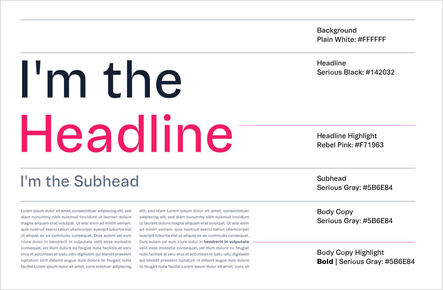
Text in colors
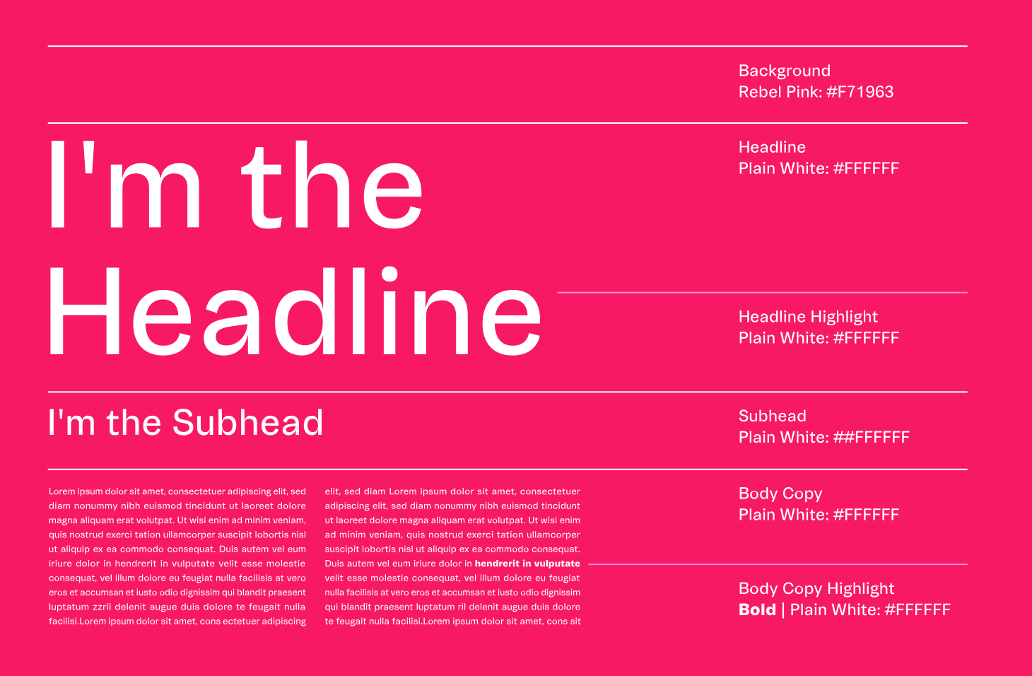
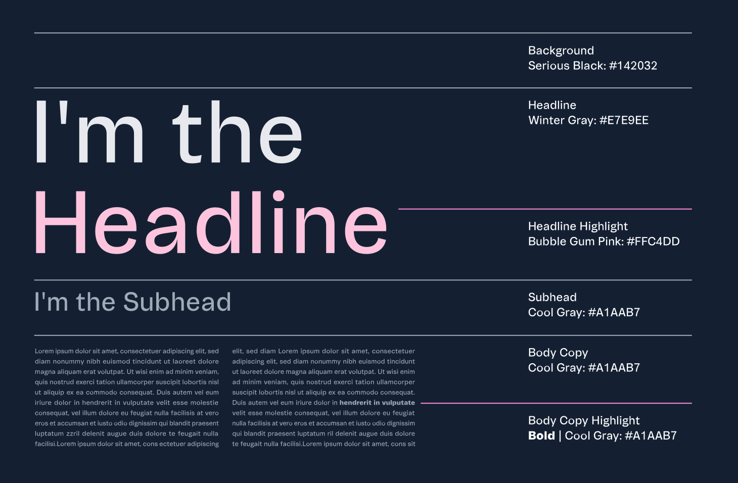
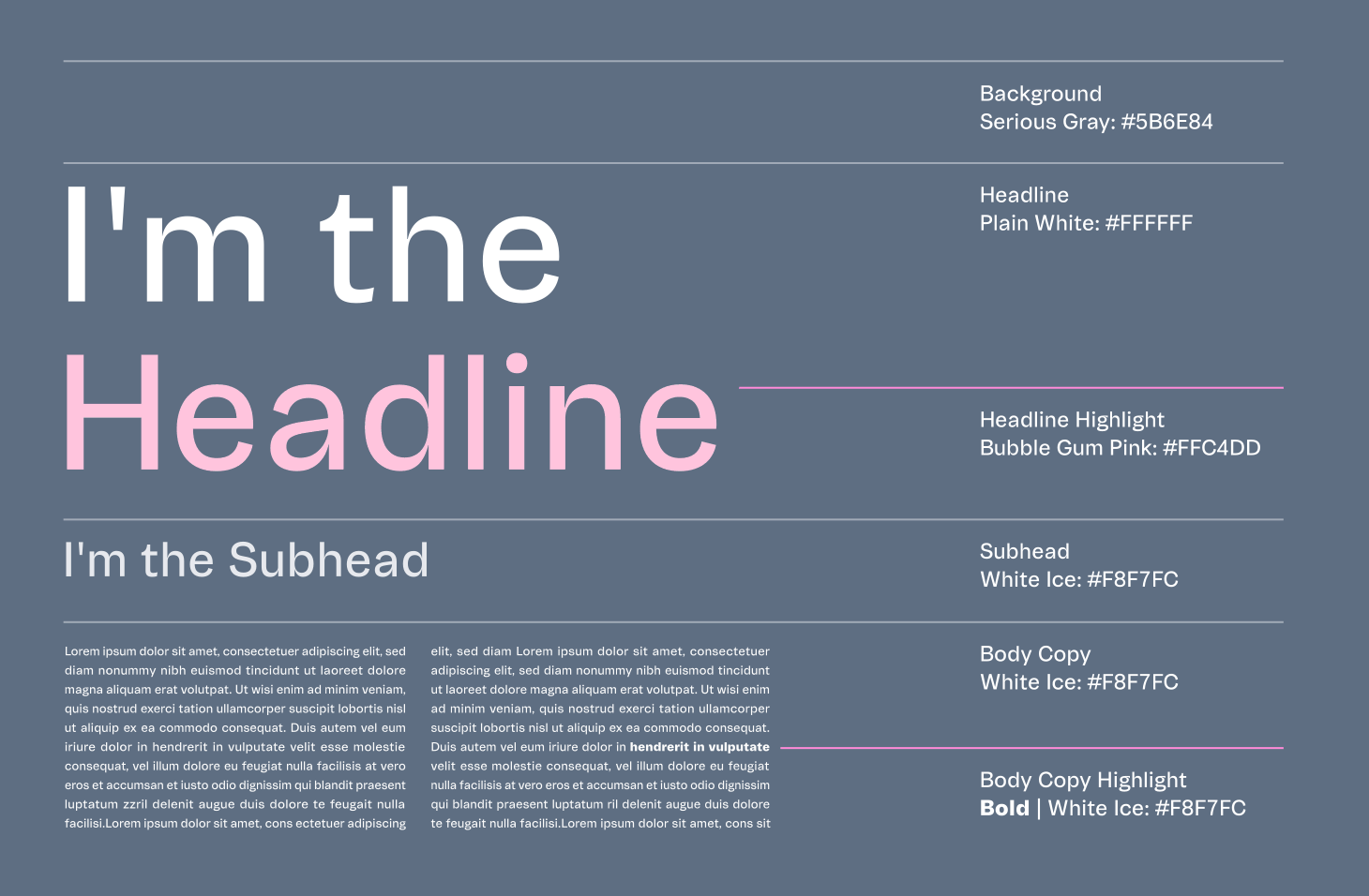
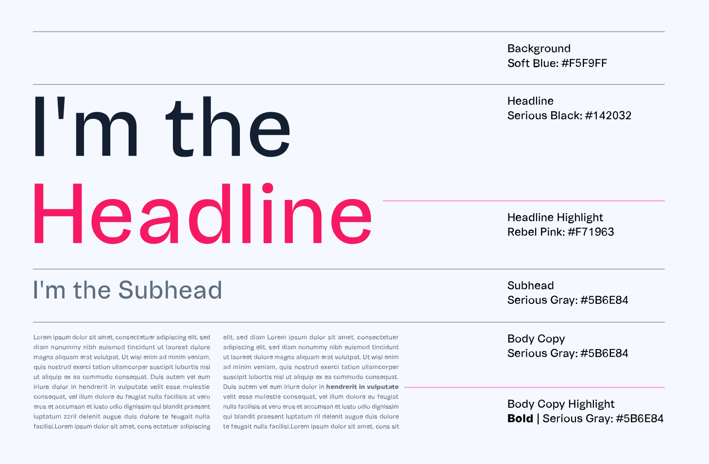
Using a single weight for the typeface, VTEX Trust Regular (with some exceptions to body text weights, allowing bold and italics when necessary to stress a term or phrase), our system finds harmonization in the text composition by color principles. Check the variations below:
Color crimes
We know that using and combining colors to achieve a harmonious result can be relative. However, to ensure consistency in our visual identity, always avoid the following examples: