Ads
Platform
Ads
Platform
To reinforce VTEX's main identity and ensure consistency in the use of the global brand, the font chosen to create the "VTEX Ads Platform" logo is VTEX Trust.
If it is necessary to use the brand in typographic format, always use the Medium weight. The use of Regular or any other weight in the Logo typography is not allowed.
The logo has a 2-line variation. The line height should always be set to 100% and the letter spacing should always be set to -4%.
To reinforce VTEX's main identity and ensure consistency in the use of the global brand, the font chosen to create the "VTEX Ads Platform" logo is VTEX Trust.
PlatformVTEX Ads
Platform
If it is necessary to use the brand in typographic format, always use the Medium weight. The use of Regular or any other weight in the Logo typography is not allowed.
Ads
PlatformVTEX
Ads
Platform
The logo has a 2-line variation. The line height should always be set to 100% and the letter spacing should always be set to -4%.
The protection area X is defined by the height of the letter "X" in the logo. No element may invade this area around the logo.



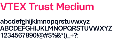
Exclusive use in logos when typographic composition is necessary. Never use the Medium weight beyond the 3 "VTEX Platforms".
Use VTEX Trust Medium with 100% line spacing and -4% letter spacing.
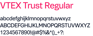
Use for titles, subtitles, and/or highlight texts. Never use the Regular weight as Brand for the 3 "VTEX Platforms".
Use VTEX Trust Regular with 120% line spacing and -4% letter spacing.
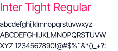
Use for titles, subtitles, and/or highlight texts. Never use the Regular weight as Brand for the 3 "VTEX Platforms".
Use Inter Tight Regular with line height 150% and letter spacing 0%.
In terms of font proportion, take X = Base font to help build proportionality and follow the standard of X for base font, 2X for secondary font, and 3X for Primary Font.

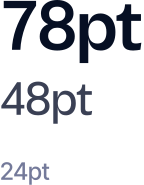
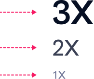
In terms of margin proportion between fonts, take X = Margin between Primary and Secondary Font. The margin between this block and the Base Font should be 1.5x.

New agent-like experience to manage campaigns, from setup to optimization.
New agent-like experience to manage campaigns, from setup to optimization.
New agent-like experience to manage campaigns, from setup to optimization.
Example of centered single-line logo application, using VTEX Trust Medium with 100% line height and -4% letter spacing. In the subtitle, correct example of VTEX Trust Regular application, followed by the text block with the Inter Tight font.
Colors are an essential means of expression that help promote identification and define the tone of communication. The VTEX Ads Platform uses the pink palette as its main identity.
Pink
Default
Black
Darker
Dark
Light
Dark
Default
Lightest
Darkest
Light
Always prioritize the use of the 3 logos in Rebel Pink. That is what makes our brand recognizable at first sight.
Ads
Platform
On backgrounds with prominent primary color
Use logo in the color Branca
Ads
Platform
On backgrounds with prominent secondary color
Use logo in the color Branca
Ads
Platform
On lighter backgrounds with less prominent color
Use logo in the color Sirius Black
Ads
Platform
On almost white or nearly colorless backgrounds
Use logo in the color Sirius Black
Ads
Platform
On White backgrounds
Use logo in the color Sirius Black
Ads
Platform
On extremely dark backgrounds (Sirius Black)
Use logo in the color Branca
Ads
Platform
On dark backgrounds (Secondary Darker)
Use logo in the color Branca
Ads
Platform
On bluish backgrounds with prominent color
Use logo in the color Branca
Ads
Platform
On backgrounds with prominent neutral gray
Use logo in the color Branca
Ads
Platform
On less prominent Gray backgrounds
Use logo in the color Branca
Gradients are part of the identity to be used at certain times and assets to provide even more visual and narrative reinforcement.
Ads
Platform
White on pink gradient
Use logo in the color Branca
Ads
Platform
White on dark gradient
Use logo in the color Branca
Ads
Platform
Sirius Black in neutral gradient
Use logo in the color Sirius Black
Don't commit these sins with VTEX Ads Platform
Ads
Platform
Do not use Sirius Black on gradient pink backgrounds
Ads
Platform
Do not use Rebel Pink on dark gradient backgrounds
Ads
Platform
Do not apply gradient to text on gradient backgrounds
Ads
Platform
Do not use gradient directly on the 3 Platforms logo
Ads
Platform
Do not use gradient tones that were not presented in this guide



In certain marketing actions or when using specific pieces, images are necessary tools, but they must be managed carefully when used with our visual identity.

On abstract backgrounds, always try to position the brand in the cleanest parts of the image
And use the logo in the color Branca em imagens com cores evidentes

Em fundos com elementos em 3D, busque sempre posicionar a marca nas partes mais limpas
And use the logo in the color Branca em imagens com cores escuras
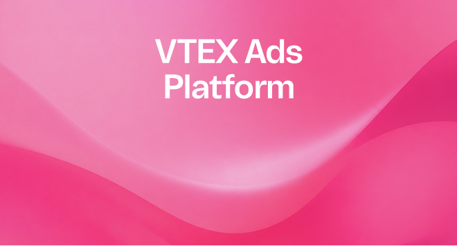
In photographs, try to position the brand in the cleanest areas
Use the logo in the color Sirius Black em imagens com cores claras
The minimum size for any of the three brands, when using points as the unit of measurement, is 16 pt. Never use the brand below this size.
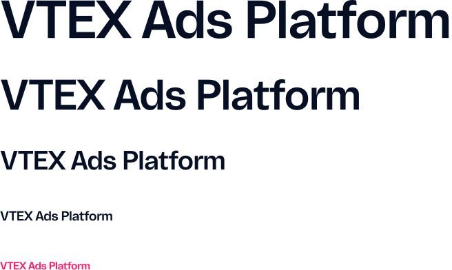
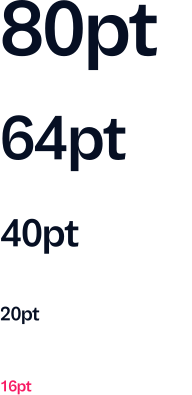
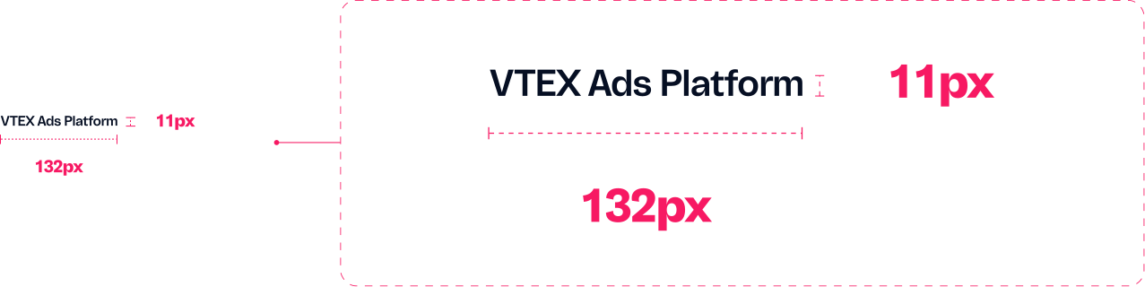
The minimum logo usage size in media .pt is 16, which in pixels corresponds to a measurement of 132px width by 11px height.