To reinforce VTEX's main identity and ensure consistency in the use of the global brand, the font chosen to create the "VTEX Commerce Platform" logo is VTEX Trust.
If it is necessary to use the brand in typographic format, always use the Medium weight. The use of Regular or any other weight in the Logo typography is not allowed.
Another factor is that the logo has a 2-line variation (more details on the following pages). The line height, therefore, should always be set to 100% and the letter spacing (in all formats) should always be set to -4%.
To reinforce VTEX's main identity and ensure consistency in the use of the global brand, the font chosen to create the "VTEX Commerce Platform" logo is VTEX Trust.
PlatformVTEX Commerce
Platform
If it is necessary to use the brand in typographic format, always use the Medium weight. The use of Regular or any other weight in the Logo typography is not allowed.
Commerce
PlatformVTEX
Commerce
Platform
Another factor is that the logo has a 2-line variation (more details on the following pages). The line height, therefore, should always be set to 100% and the letter spacing (in all formats) should always be set to -4%.
The protection area X is defined by the height of the letter "X" in the logo. No element may invade this area around the logo.



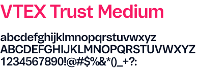
Exclusive use in logos when typographic composition is necessary. Never use the Medium weight beyond the 3 "VTEX Platforms".
Use VTEX Trust Medium with 100% line spacing and -4% letter spacing.
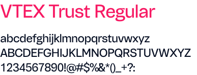
Use for titles, subtitles, and/or highlight texts. Never use the Regular weight as Brand for the 3 "VTEX Platforms".
Use VTEX Trust Regular with 120% line spacing and -4% letter spacing.
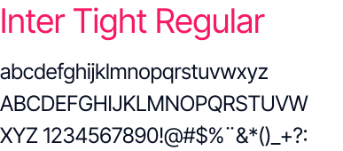
Use for titles, subtitles, and/or highlight texts. Never use the Regular weight as Brand for the 3 "VTEX Platforms".
Use Inter Tight Regular with line height 150% and letter spacing 0%.
In terms of font proportion, take X = Base font to help build proportionality and follow the standard of X for base font, 2X for secondary font, and 3X for Primary Font (in this case the Logo in typography).

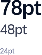
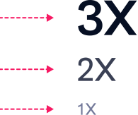
In terms of margin proportion between fonts, take X = Margin between Primary and Secondary Font. Finally, the margin between this block and the Base Font should be 1.5x (for example, in the case below 1X = 32, so the space between the Primary and Secondary Font block will be 48 (1.5X)).

O VTEX AI Workspace oferece às equipes de comércio um sistema operacional nativo de IA que automatiza fluxos de trabalho.
O VTEX AI Workspace oferece às equipes de comércio um sistema operacional nativo de IA que automatiza fluxos de trabalho.
O VTEX AI Workspace oferece às equipes de comércio um sistema operacional nativo de IA que automatiza fluxos de trabalho.
Exemplo de aplicação centralizada do logo em linha única, usando VTEX Trust Medium com entre-linha 100% e entre-letra -4%. No subtítulo, exemplo correto de aplicação da VTEX Trust Regular, seguida pelo bloco de texto com a fonte Inter Tight. Outro Exemplo centralizado correto em caso do uso do logo em linha dupla com entrelinha em 100% para o logo 120% para Subtítulo e 150% para bloco de texto. Por fim, a mesma abordagem deve ser feita no modelo de linha tripla alinhado pelo meio (centralizado).
Colors are an essential means of expression that help promote identification and define the tone of communication. Below, you will find the main principles of our color code. For printed materials, the use of CMYK codes is mandatory.
Pink
Default
Black
Darker
Dark
Light
Dark
Default
Lightest
Darkest
Light
Always prioritize the use of the 3 logos in Rebel Pink. That is what makes our brand recognizable at first sight. Obviously, it can also be applied in different colors as shown in the examples below.
Commerce
Platform
Em fundos escuros ou com cor mais evidente
Use logo na cor Branca
Commerce
Platform
Em fundos menos escuros ou com cor menos evidente
Use logo na cor Sirius Black
Commerce
Platform
Em fundos mais claros com cor menos evidente
Use logo na cor Sirius Black
Commerce
Platform
Em fundos quase brancos ou quase sem cor
Use logo na cor Sirius Black
Commerce
Platform
Em fundos Brancos
Use logo na cor Sirius Black
Commerce
Platform
Em fundos Extremamente escuros (Sirius Black)
Use logo na cor Branca
Commerce
Platform
Em fundos escuros (Secondary Darker)
Use logo na cor Branca
Commerce
Platform
Em fundos azulados com cor evidente
Use logo na cor Branca
Commerce
Platform
Em fundos com cinza neutro em evidência
Use logo na cor Branca
Commerce
Platform
Em fundos Cinza menos evidentes (Neutral Dark)
Use logo na cor Branca
Gradients are part of the identity to be used at certain times and assets to provide even more visual and narrative reinforcement.
Commerce
Platform
Branco em gradiente rosa
Use logo na cor Branca
Commerce
Platform
Branco em gradiente escuro
Use logo na cor Branca
Commerce
Platform
Sirius Black em gradiente neutro
Use logo na cor Sirius Black
Don't commit these sins with VTEX Commerce Platform
Commerce
Platform
Não use Sirius Black em fundos com gradiente rosa
Commerce
Platform
Não use Rebel Pink em fundos com gradiente escuro
Commerce
Platform
Não aplique gradiente no texto em fundos com gradiente
Commerce
Platform
Não use gradiente diretamente no logo das 3 Platforms
Commerce
Platform
Não use outros tons de gradiente que não foram apresentados neste guia



In certain marketing actions or when using specific pieces, images are necessary tools, but they must be managed carefully when used with our visual identity.
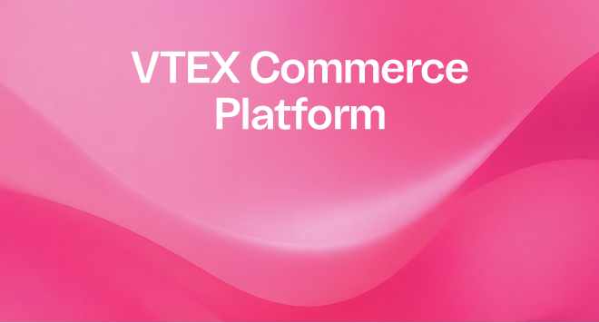
Em fundos abstratos, busque sempre posicionar a marca nas partes mais limpas da imagem (para que a legibilidade do logo seja preservada)
E use o logo na cor Branca em imagens com cores evidentes

Em fundos com elementos em 3D, busque sempre posicionar a marca nas partes mais limpas (para que a legibilidade do logo seja preservada)
E use o logo na cor Branca em imagens com cores escuras

Em fotografias, busque posicionar a marca nas partes mais limpas (para que a legibilidade do logo seja preservada)
Use o logo na cor Sirius Black em imagens com cores claras
The minimum size for any of the three brands, when using points as the unit of measurement, is 16 pt. Never use the brand below this size.
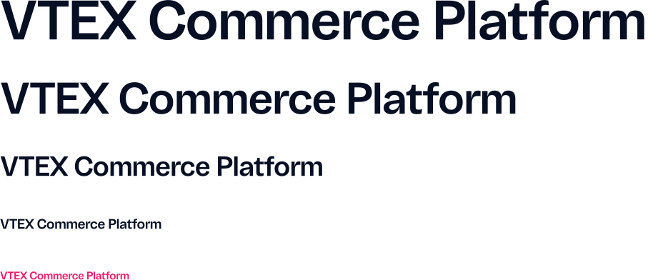
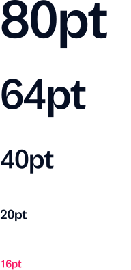
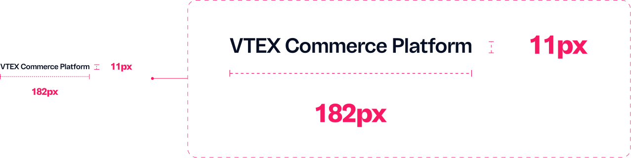
The minimum logo usage size in media .pt is 16, which in pixels corresponds to a measurement of 182px width by 11px height.