The logo is the synthesis of our company. It conveys our personality while being unique and recognizable. Combining icon, wordmark, and Rebel Pink, the VTEX logo stands out among the cool brands in the technology market.
Applications
Always prioritize using the logo in Rebel Pink. That is what makes our logo recognizable at first sight.
See how to apply our logo to different backgrounds.




Clearspace
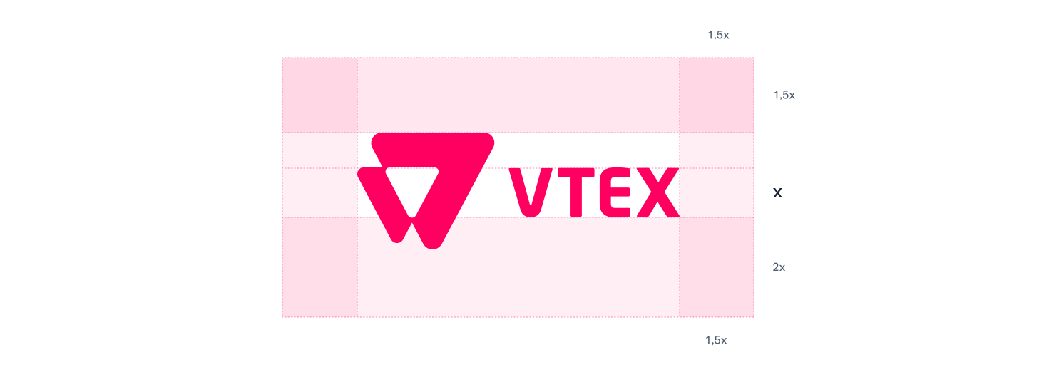
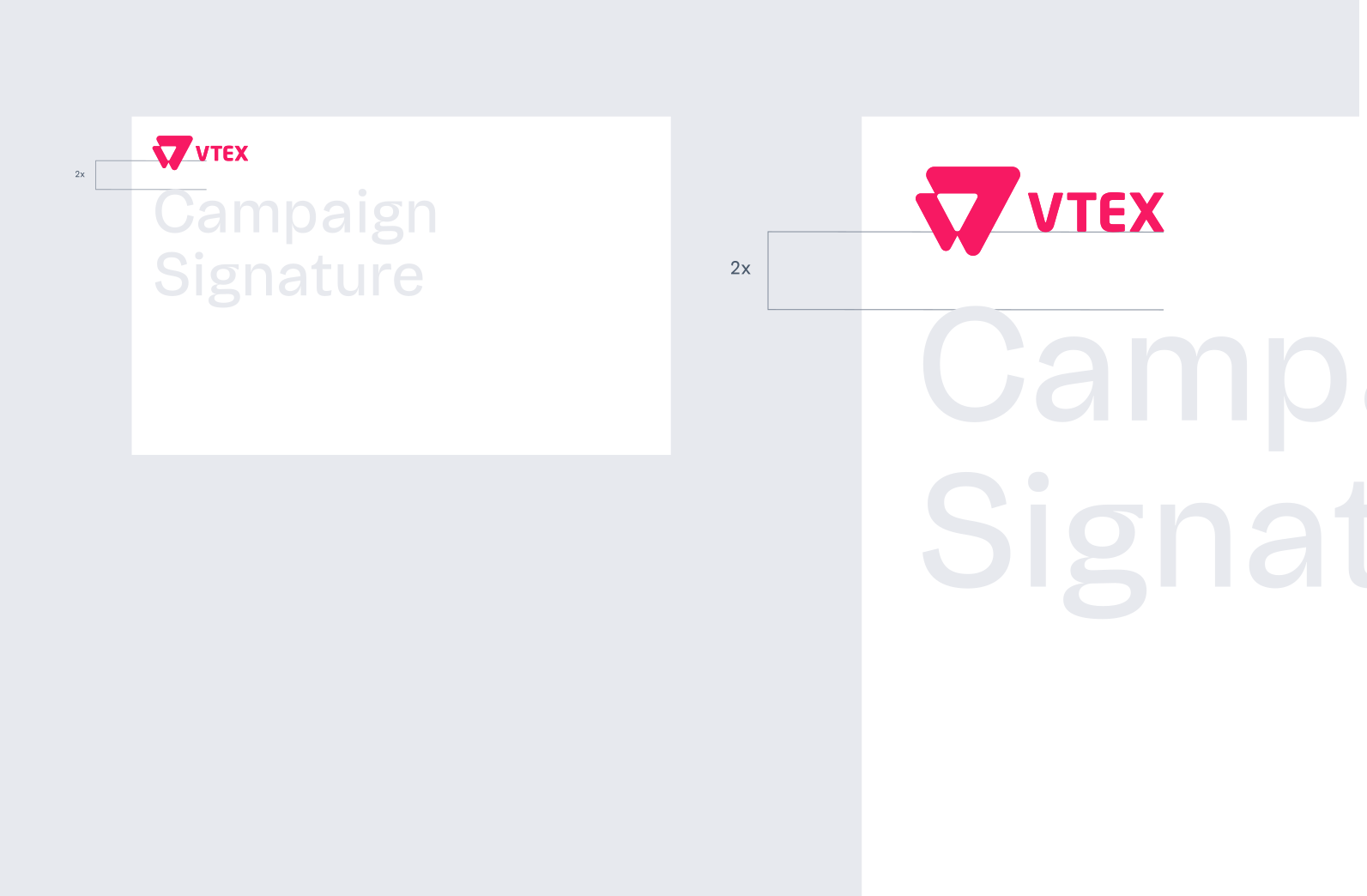
When a logo steps out into the real world, it needs space to breathe and shine to look its best. That is why we established a clearspace around it to guarantee readability.
In our case, the reference measure is the vertical axis of the word "VTEX". It is fundamental to always position other visual elements outside this white margin in every application.
Logo Crimes




Reduction
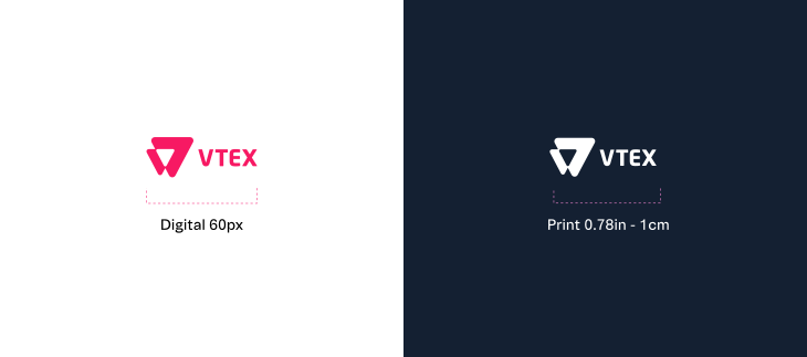
When our logo requires a reduction in size for any kind of use, we should follow a minimum size baseline of 60px (digital), 1 cm (print) and 0.78 in (print).
Considerations
These are some best practices to keep our brand healthy:
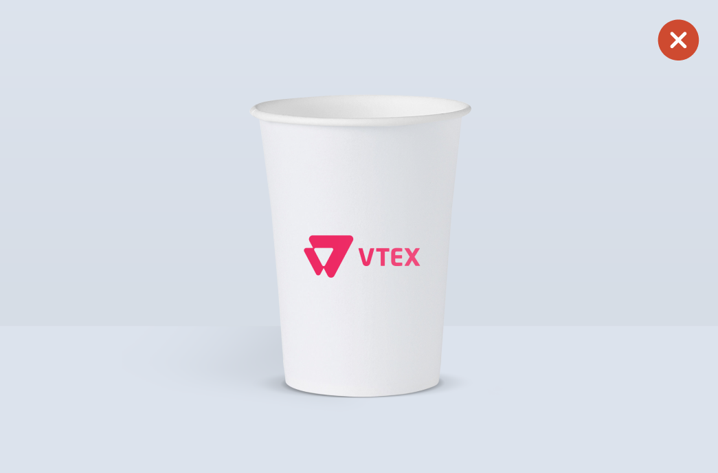
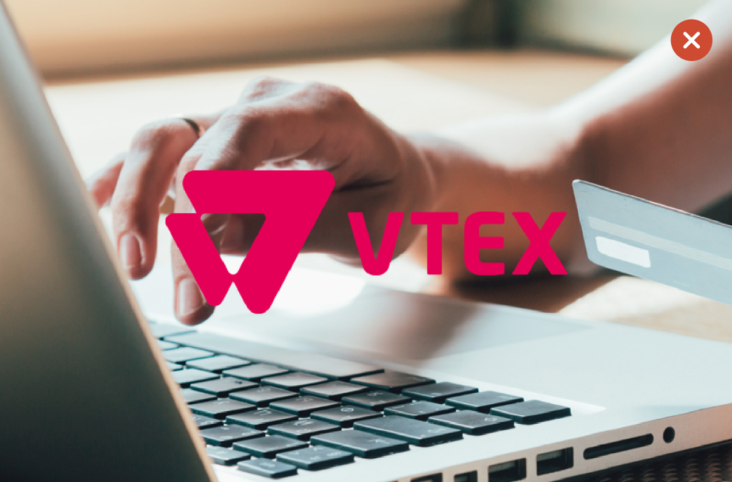
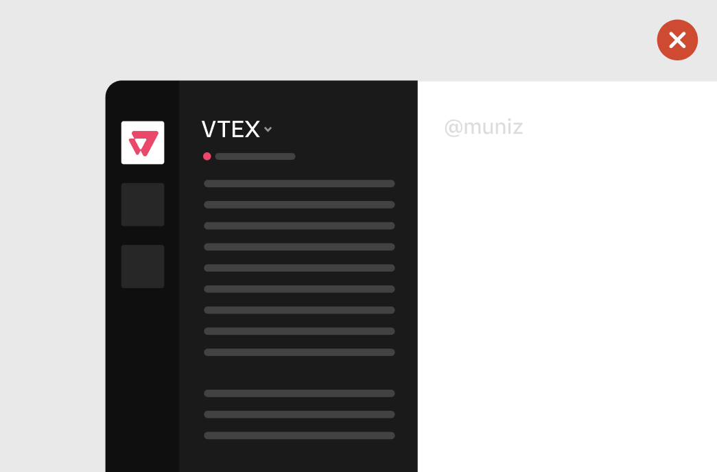
Sticky Notes
Except in digital platform avatars, do not use the icon without the wordmark.
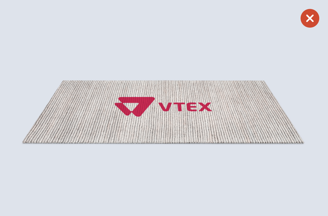
Prioritize using the logo with the presence of Rebel Pink.