VTEX Trust, our custom typeface family, is unique and easy to use, reflecting our brand spirit, beliefs and design principles. It has been carefully designed to meet our needs as a global technology company.
Trust is what bond us together
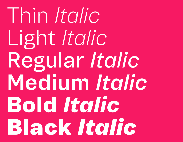
VTEX Trust comes in a full range of weights and italics. Across our communications we rely on it to express our personality with clarity and consistency.
 DOWNLOAD FONT
A single weight
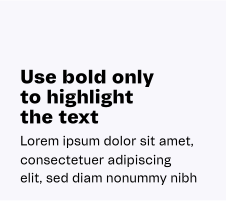
We only use the Regular weight of the VTEX Trust typography. Use colors and the typographic scale to create visual hierarchy in titles, subheads, and body text. There are some exceptions to body text weights, allowing bold and italics when necessary to stress a term or phrase.
Scale
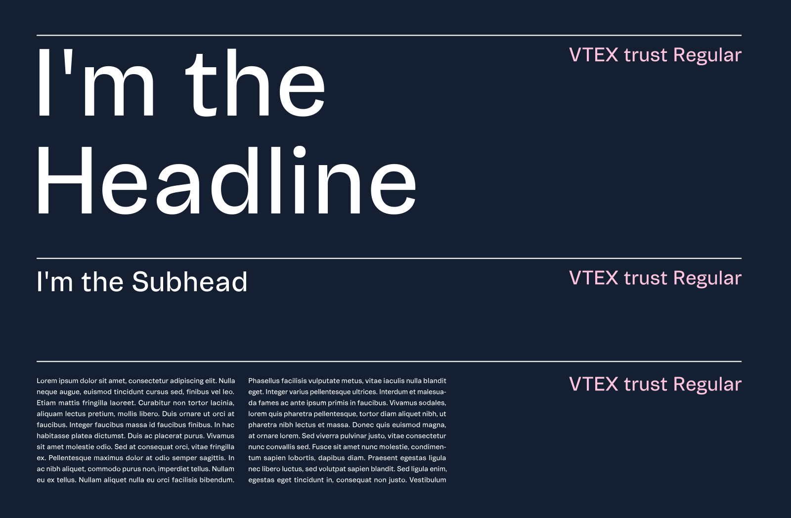
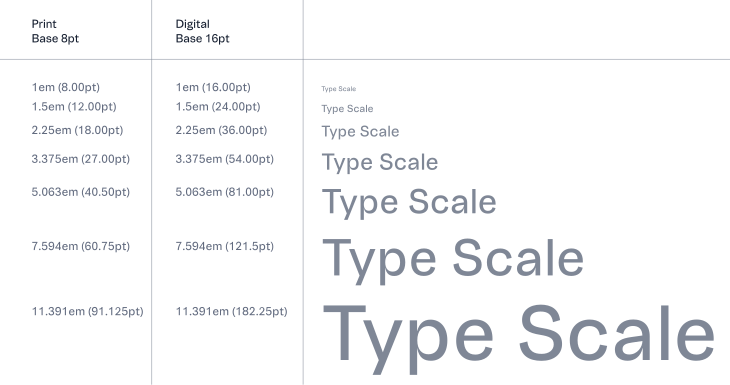
The scale creates size variations that maintain every piece with the right balance and refinement while making it easier to decide which size to use.
The system is based on the 1.5 scale (the perfect fifth) to ensure hierarchy and strong contrast between messages using only one font weight. To access the typographic scale generator, visit: type-scale.com.
Leading
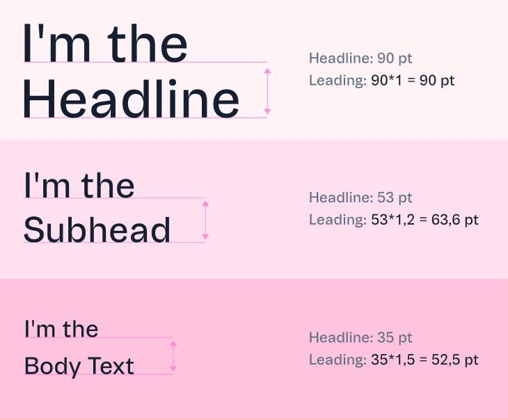
The space between lines follows a logic of proportion: for headings, the space between lines must be 100% the size of the typeface; subheads must be 120% the size of the typeface; for the body text, the space between lines must be 150% the size of the typeface.
Alignment
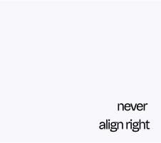
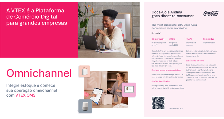
Whenever possible, align the text to the left. It creates a precise vertical alignment between elements, adding legibility, organization, and clarity to our composition.
Distance-based baseline
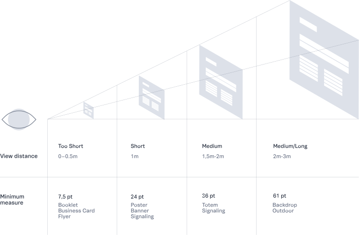
Considering a proportion of 1.5 in-text scale, different base units have been assigned according to the media viewing distance. The assignment of bases allows minimum readability regarding the various contents and the different printed media dimensions.
Text in colors
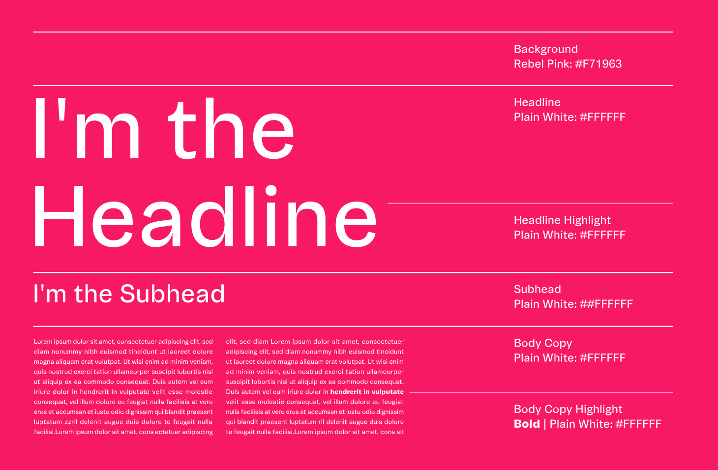
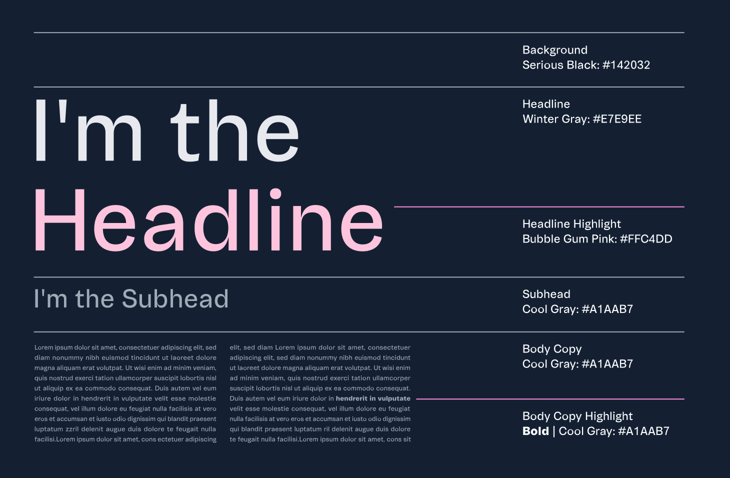
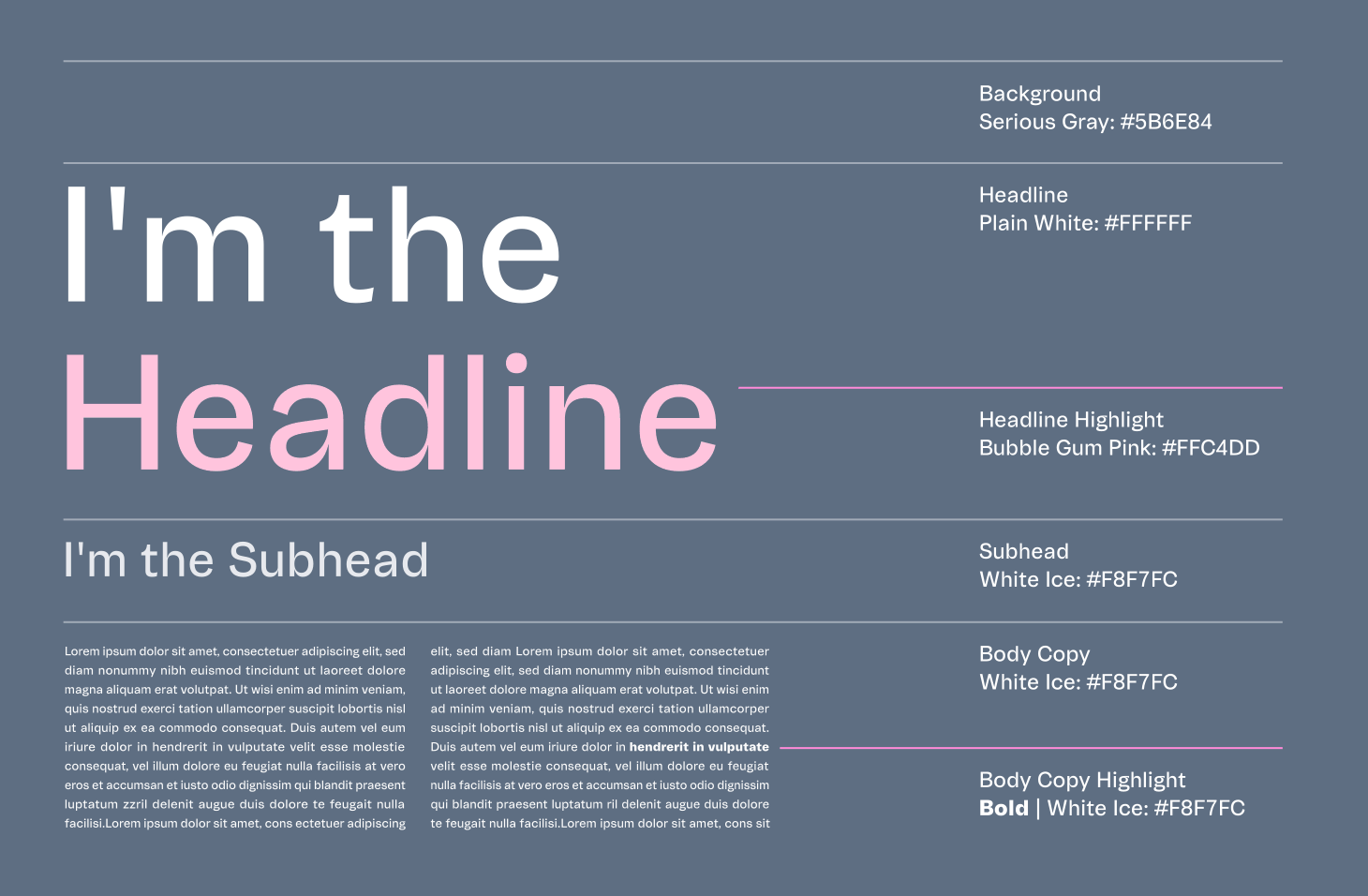
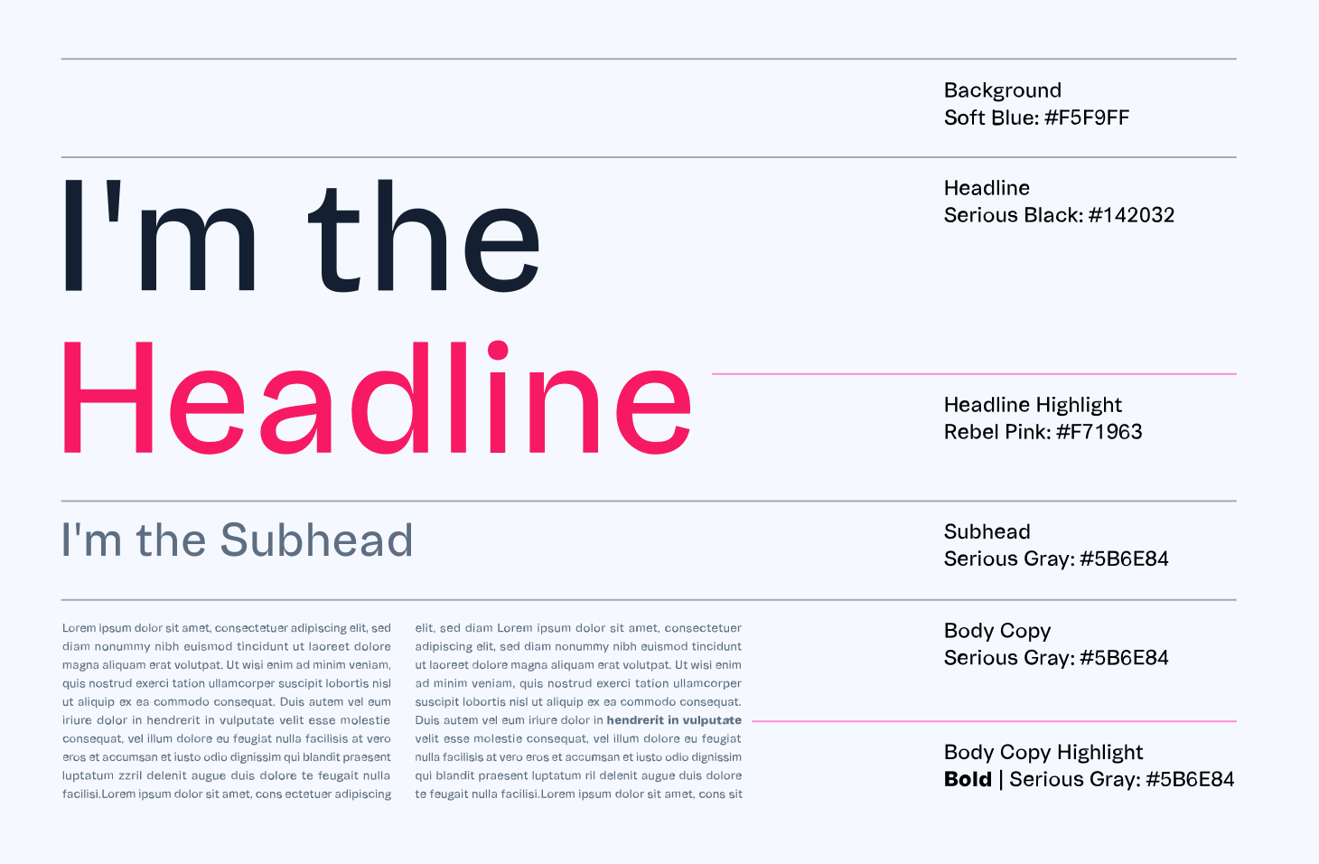
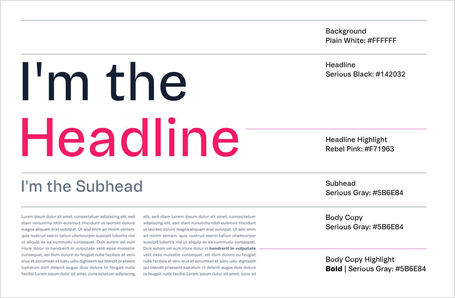
Using a single weight for the typeface, VTEX Trust Regular (with some exceptions to body text weights, allowing bold and italics when necessary to stress a term or phrase), our system finds harmonization in the text composition by color principles. Click on the colors and see how the texts are applied in different backgrounds:
Typography crimes
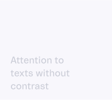
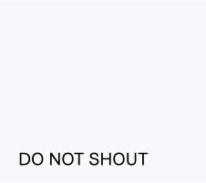
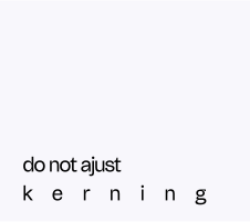
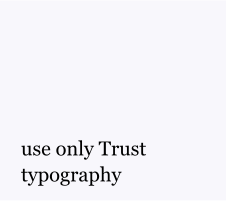
To keep our typography consistent and legible across every touchpoint, always avoid the following examples: